


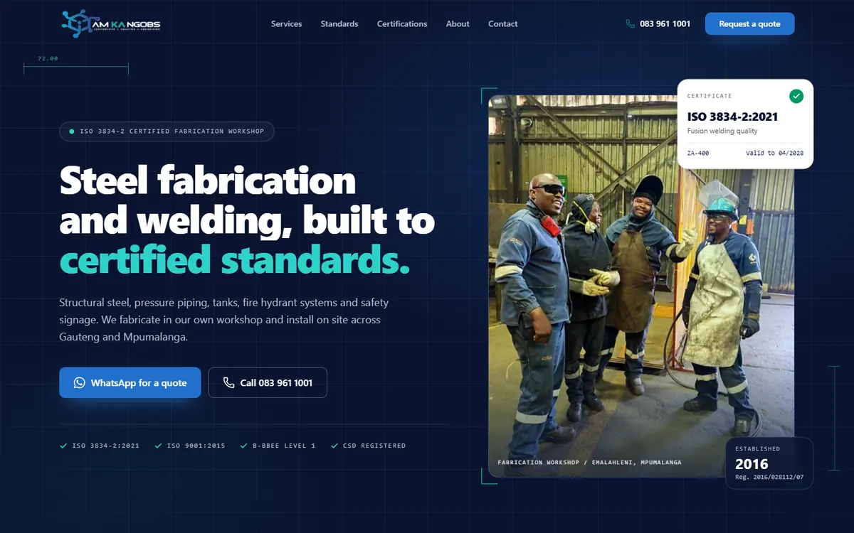
Steel fabrication and welding
AM KA NGOBS
Gauteng and Mpumalanga
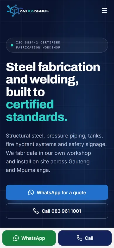
An engineering contractor website that puts ISO certification, the services and a WhatsApp quote request on the first screen.
Live websites we have designed and built for businesses in Johannesburg, Gauteng and beyond, each with a short case study. Further down are a few concept designs for other trades.
The live GoGreen Plumbers website gives Johannesburg visitors the essentials immediately: the service, the location and two direct ways to make contact.
Gauteng and Mpumalanga
An engineering contractor website that puts ISO certification, the services and a WhatsApp quote request on the first screen.
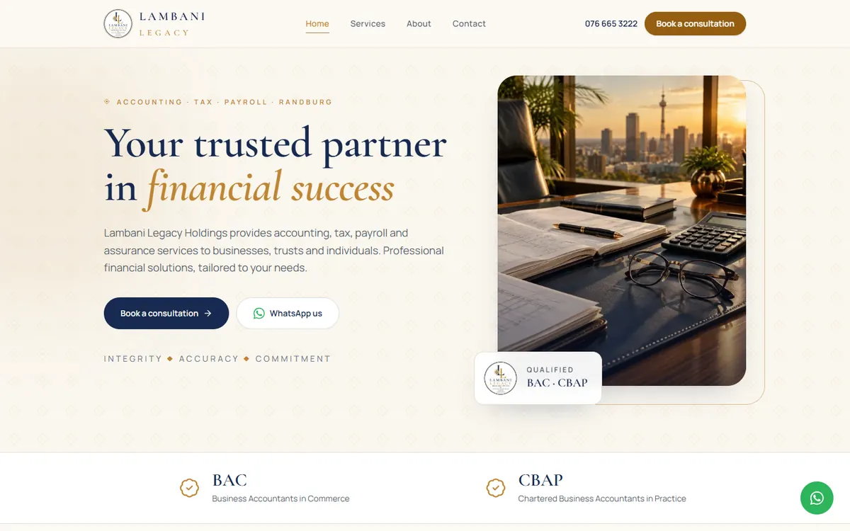
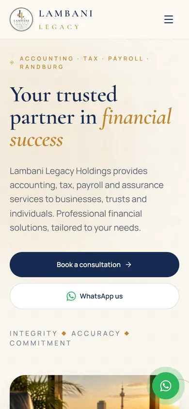
Randburg, Johannesburg
A calm navy and gold site for an accounting, tax and payroll practice, with qualifications and a consultation booking up front.
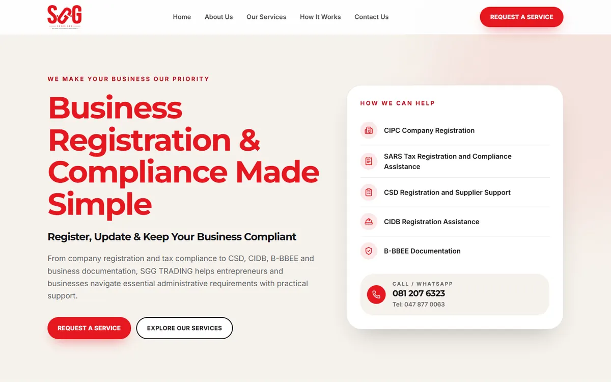
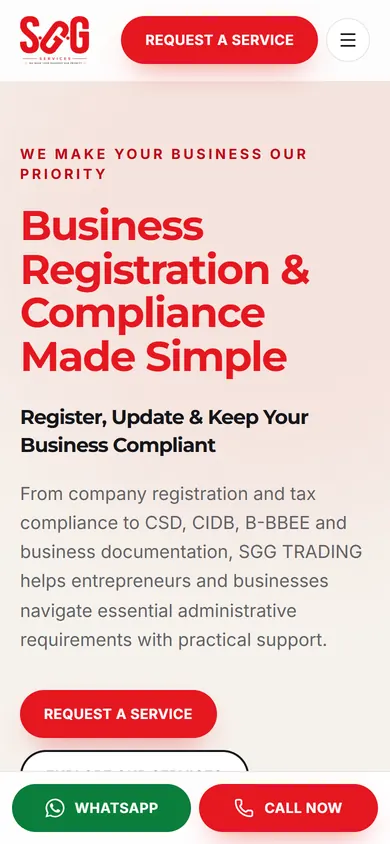
Eastern Cape, serving clients across South Africa
A deliberately simple site in the owner's own wording, listing every registration and compliance service with an enquiry button on each one.
South Africa
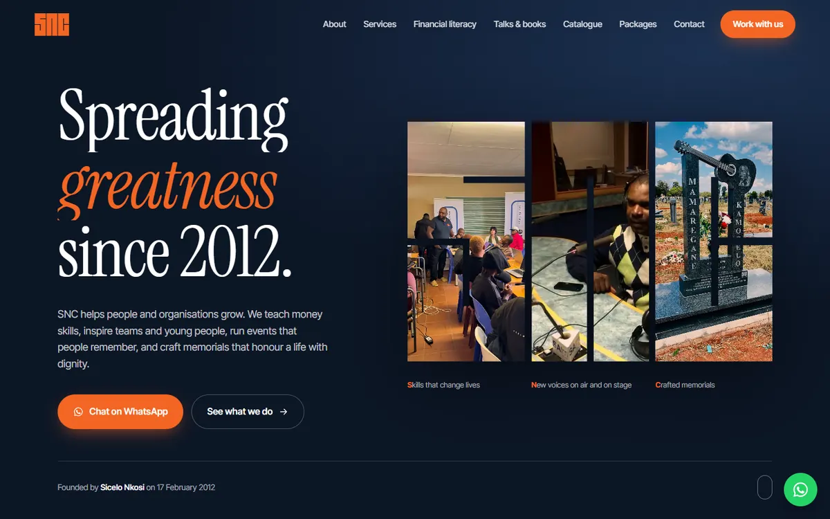
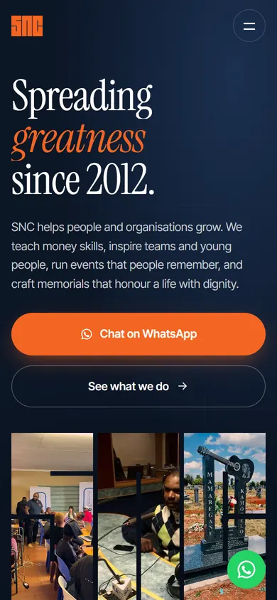
A bold site that brings training, talks, events and a full tombstone catalogue together, with a searchable catalogue and WhatsApp enquiries.
Fourways, Johannesburg
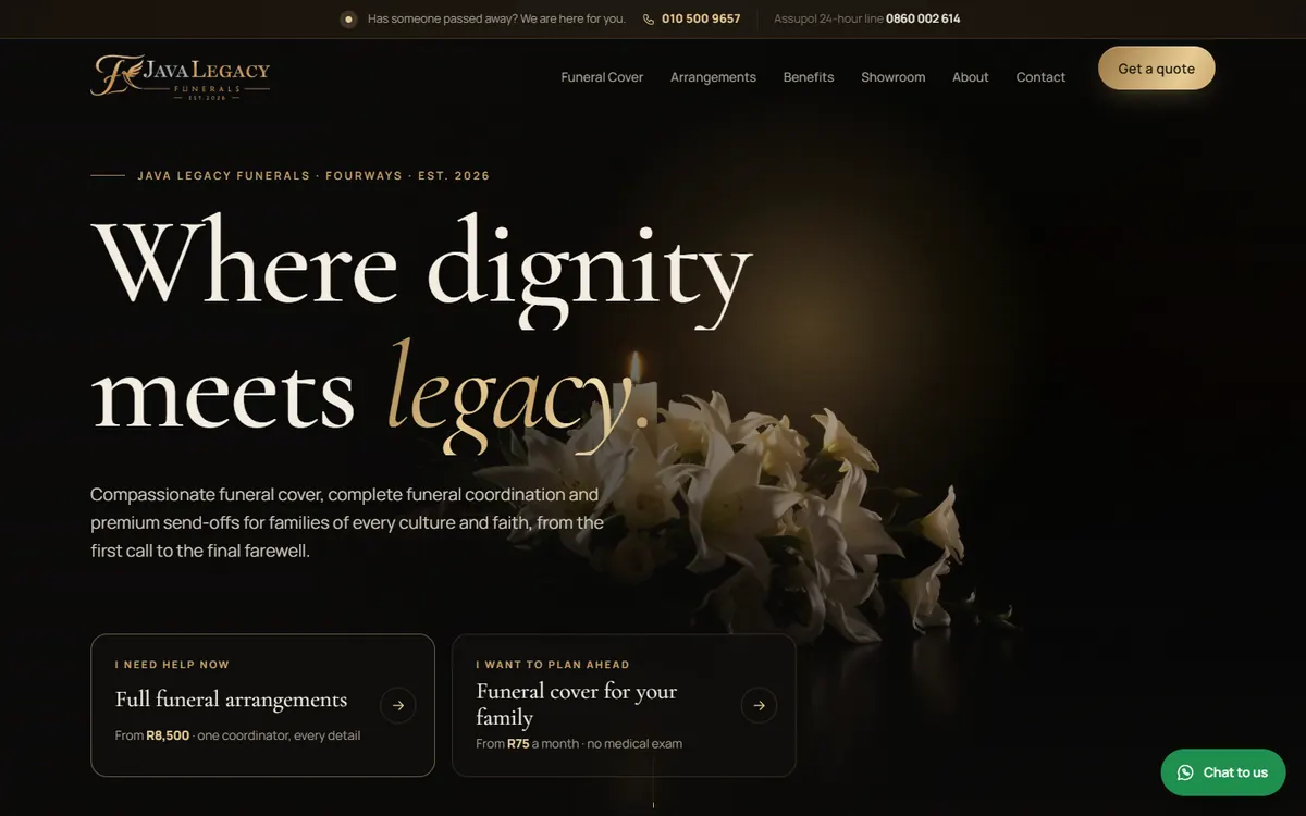
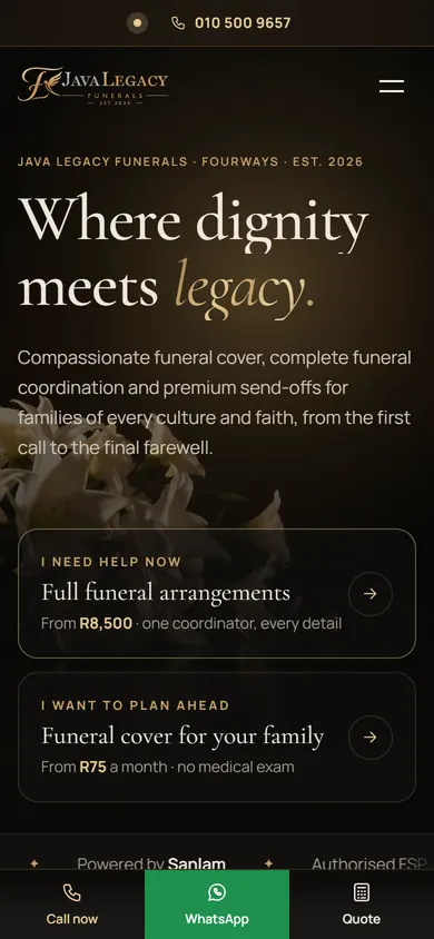
A rebuilt site that separates immediate funeral arrangements from planning ahead, with a cover calculator and a clear first call to make.
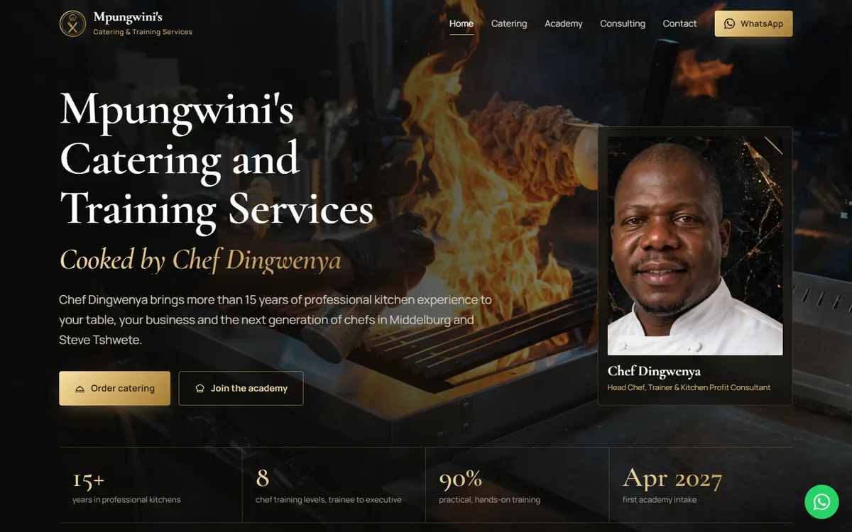
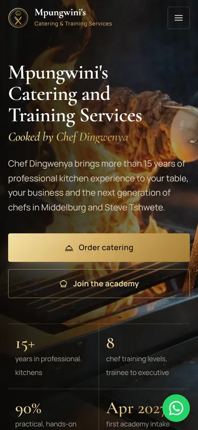
Middelburg, Mpumalanga
A rich, photo-led site for a caterer, chef academy and kitchen consultant, with real prices and separate paths for each audience.
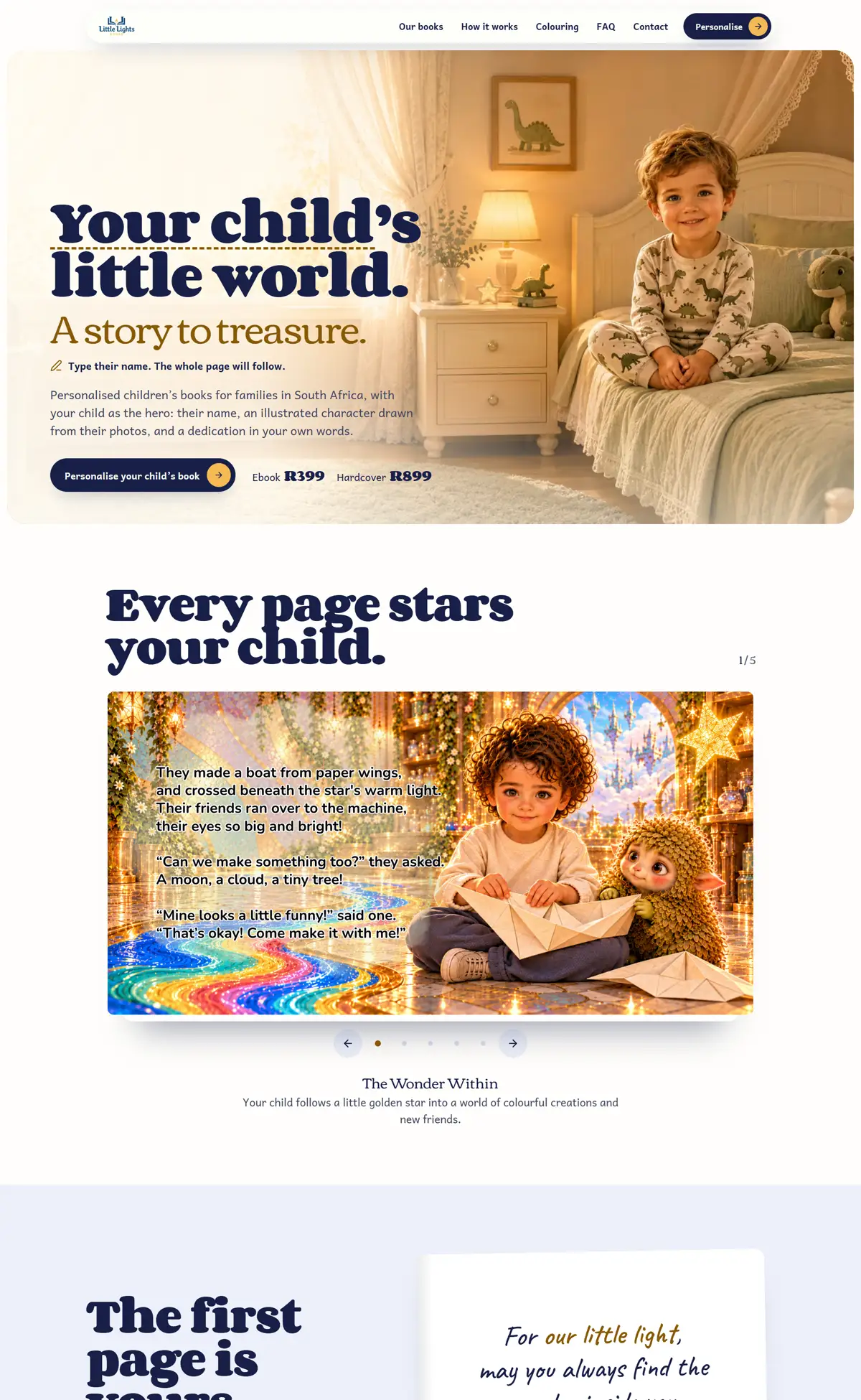
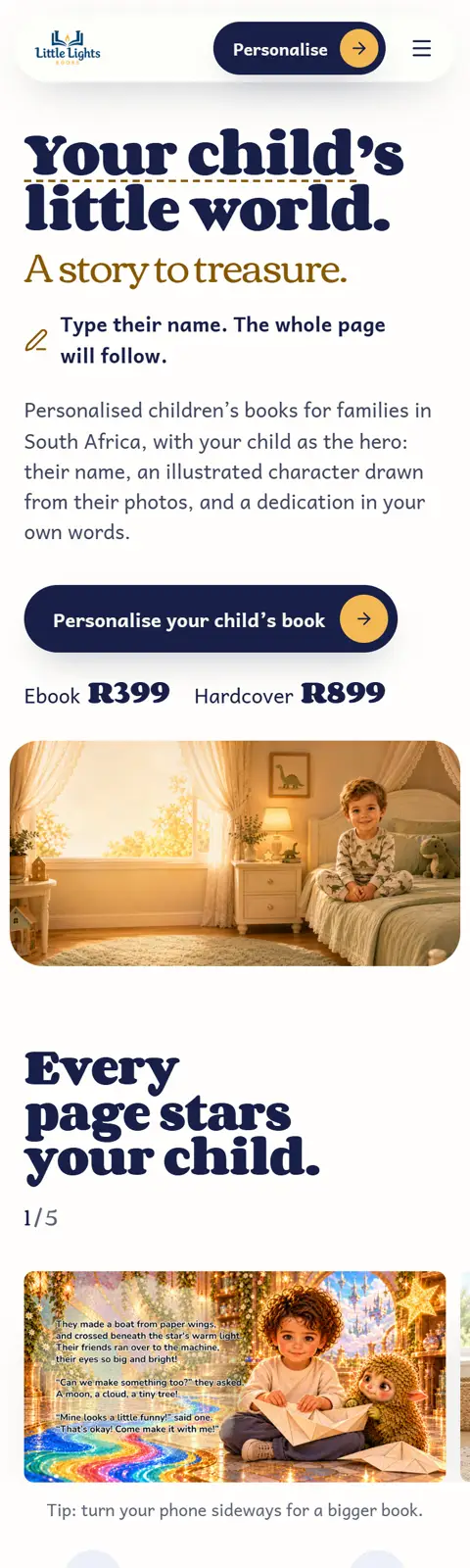
Little Lights Books is our own brand, not a client project: personalised children’s books for families in South Africa. We designed and built the whole site, from the storefront to ordering and a paid colouring app.
These are concept designs we made ourselves, not client sites. Each one takes a common problem, like a buried phone number or a menu nobody can read on a phone, and shows how we’d fix it. Photography: Unsplash.
Gentle treatment for the whole family. Medical aid claims submitted for you.
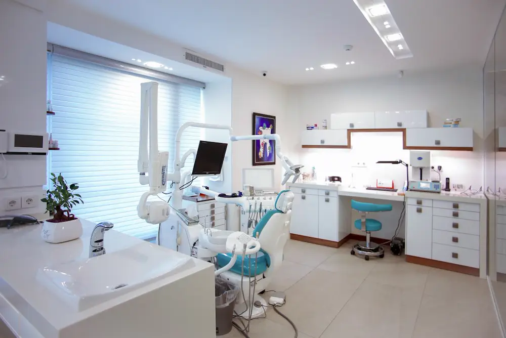
The problem: Most dental practice sites bury the one thing a patient wants: when can I be seen. Phone numbers sit in a footer and booking is a form nobody finishes.
The approach: Availability is placed on the first screen with a visible appointment grid, a tap-to-call number in the header and a single booking action repeated in view.
Get this for my businessPersonalised skin, hair and styling rituals in a calm studio off Jan Smuts Avenue.
Book a visit
The problem: Salon sites often look dated next to the studio's own Instagram, so the website lowers perceived quality instead of raising it.
The approach: An editorial layout with generous space, a restrained palette and clear service pricing so the site matches the standard of the work.
Get this for my business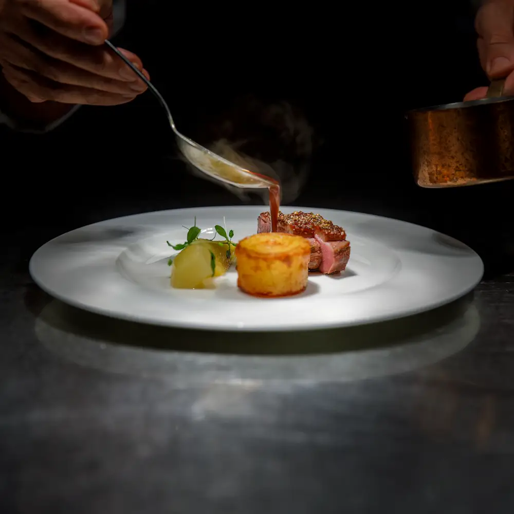
The problem: Diners look for the menu, hours and a way to book. PDF menus and social-only pages lose the booking on a phone.
The approach: A readable on-page menu, trading hours in plain sight and a reservation action fixed in the layout rather than hidden in navigation.
Get this for my business
Company structures, commercial contracts and disputes for owner-managed businesses.
Book a consultationThe problem: Law firm sites often read as generic templates, which undermines the credibility the practice actually has.
The approach: A formal two-column structure, a stated practice focus and a single consultation action, so seriousness is communicated by design not adjectives.
Get this for my business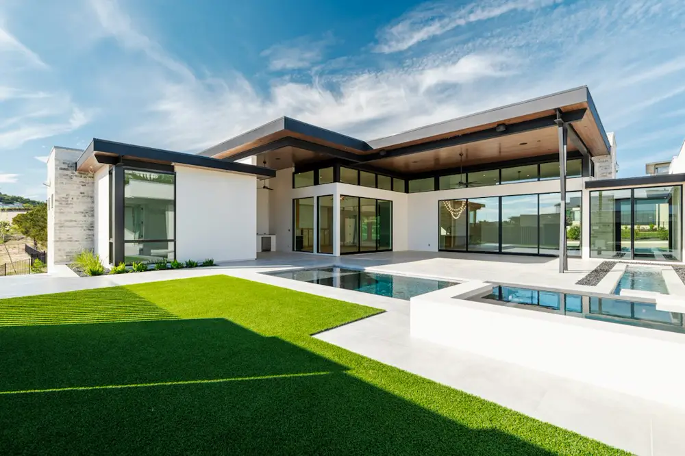
The problem: Property sites drown buyers in unfiltered listings and make enquiring harder than scrolling.
The approach: An area-first browsing layout with one featured property, prices in rand and an enquiry path attached to each listing.
Get this for my business
The problem: Studio sites explain the philosophy at length but hide the timetable and the first step to joining.
The approach: High-contrast layout with the class timetable visible and a persistent join action, so the next step is never more than one tap away.
Get this for my businessThe underlying structure of a good business website barely changes: say what you do, say where you do it, and make contact effortless. What changes is which piece of information earns the first screen. Get that order wrong and even a good-looking site loses enquiries.
For an urgent trade, availability and a tappable number win: a customer with water across the floor is not reading an About section. For a dental practice, it is when they can be seen. For a restaurant, the menu, the hours and a booking action. For a law firm, credibility and a stated practice focus, because the visitor is deciding whether to trust you with something serious. For a salon, the site has to look at least as good as the studio's own photos, or it lowers perceived quality instead of raising it. For a property agency, browsing by area beats an unfiltered wall of listings.
That is why we design around the enquiry rather than around a template. If you want to see how this applies to your own trade, the website design in Johannesburg page covers scope and process, and websites for growing businesses covers what a first website usually needs. Pricing is on the pricing page, how we work is on the about page, and if you would rather just see your own homepage, send us your details.
That's exactly what the free homepage preview is: your services, your area and your wording.
Websites from R999 once-off.